In this Data Science article, we are going to take a look at the Partial Autocorrelation Function (PACF). We will go over the background and then look at plotting both non stationary and stationary data.
If you want to watch a video based around this tutorial, it is embedded below.
PACF Background
The PACF shows the effect of lag after removing all the intermediate lags
It distinguishes whether a strong correlation at lag 3 is due to genuine dependency or a spillover effect from lags 1 and 2
The difference between ACF and PACF is the inclusion or exclusion of indirect correlations in the calculation.
ACF shows total correlations, while PACF isolates the direct effect.
Tutorial Prep
To start the lesson, bring in Pandas, Numpy, Matplotlib, and plot_pacf.
					import pandas as pd
import numpy as np
import matplotlib.pyplot as plt
from statsmodels.graphics.tsaplots import plot_pacf
Next we create a dataframe. The data we are using is from kaggle which is based on all_stocks_5yr.
					df = pd.read_csv('/content/all_stocks_5yr.csv')
df.head(10)
We only want to look at the Apple stock.
apple_stock = df[df["Name"] == "AAPL"]["close"]
PACF Plot Information
The value of the coefficient ranges from -1 to 1, indicating the strength and direction of the correlation
Blue area (or line) is the significance bound which is the 95% Confidence Interval
Significant lag if the line is above the blue significance bound. This suggests that this lag has a direct effect on the current value of the time series, independent of other lags.
For example, if the PACF shows a significant spike at lag 3, it means that y(t) is significantly correlated with y(t−3) , even after accounting for the influence of lags 1 and 2.
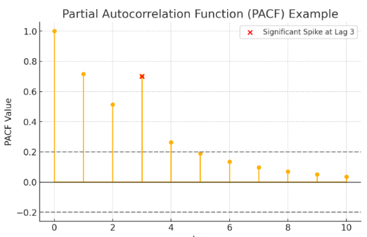
The cut-off point in the PACF plot is where the spikes drop to or remain within the confidence bounds, suggesting that higher lags do not significantly contribute to explaining the current value of the time series.
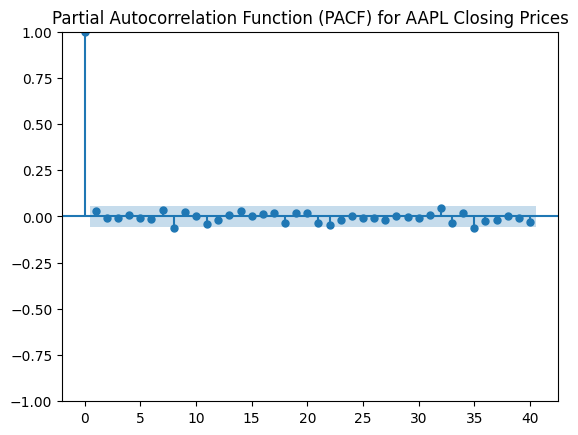
Non Stationary Data
A slowly decaying PACF plot may indicate the presence of seasonality in the data.
If the PACF does not show a clear cut-off, it might suggest that an AR model may not be a good fit, or that the data may benefit from additional preprocessing or transformation
					plt.figure(figsize=(10,5))
plot_pacf(apple_stock, lags=40, markersize=4)
plt.title("Partial Autocorrelation Function (PACF) for AAPL Closing Prices")
plt.show()
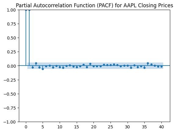
Stationary Data
Let’s now turn our data stationary by applying a logarithm to the apple_stock and then differencing
apple_stock_log = np.log(apple_stock)
apple_stock_diff = apple_stock_log.diff().dropna()
					plt.figure(figsize=(10,5))
plot_pacf(apple_stock_diff, lags=40, markersize=4)
plt.title("Partial Autocorrelation Function (PACF) for AAPL Closing Prices")
plt.show()