In this Data Science lesson we are going to take a look the Autocorrelation Function. Often abbreviated as ACF it can let us know if our data is stationary or not. We will go over some of the background behind it and plot it with the help of Python.
If you want to network with others who are passionate about Machine Learning and Data, you should join our Free Skool Community
Background Information
The ACF shows us the correlation between observations of a time series at different lags.
Data | Value | Lag 1 | Lag 2 |
1 | 100 | – | – |
2 | 125 | 100 | – |
3 | 150 | 125 | 100 |
4 | 175 | 150 | 125 |
5 | 200 | 175 | 150 |
The difference between ACF and PACF is the inclusion or exclusion of indirect correlations in the calculation. The ACF shows total correlations, while PACF isolates the direct effect.
Tutorial Prep
Let’s start this tutorial by importing pandas, numpy, matplotlib and plot_acf.
					import pandas as pd
import numpy as np
import matplotlib.pyplot as plt
from statsmodels.graphics.tsaplots import plot_acf
Now it’s time to grab the dataframe we will be using. We will grab the all_stocks_5yr dataset from Kaggle.
					df = pd.read_csv('/content/all_stocks_5yr.csv')
df.head(10)
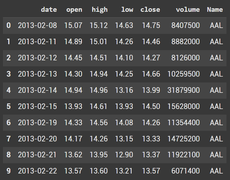
We do not want to analyze every stock. Instead lets only look at Apple.
apple_stock = df[df["Name"] == "AAPL"]["close"]
Information about the ACF Plot
Before jumping into the plots, let’s go over some information that will help describe what is being shown.
- The autocorrelation function starts a lag 0
- 1st line (lag 0) will be 1: y correlated to itself which is 1
- 2nd line (lag 1) will the correlation of: y, lag 1
- 3rd line (lag 2) will be the correlation of: y, lag 2
The height of the bars represent the correlation coefficient at the lag and the value ranges from -1 to 1, indicating the strength and direction of the correlation between the time series and its lagged values
The blue area (sometimes shown as a line) is the significance bound which is the 95% Confidence Interval. This is where random noise (white noise) is represented.
A lag is considered significant if the line is above the blue area. This means that there is a relationship between the time series values at that lag beyond what’s expected as random noise.
Non Stationary Data
Let’s look at an example with non stationary data. Since the data isn’t stationary the lags continue to gradually decrease over time instead of a sharp cutoff.
					plt.figure(figsize=(10,5))
plot_acf(apple_stock, lags=40, markersize=4)
plt.title("Autocorrelation Function (ACF) for AAPL Closing Prices")
plt.show()
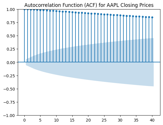
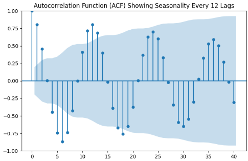
We won’t plot it in this tutorial, but another way to tell that data is not stationary is repeated peaks. This shows us there is seasonality present.
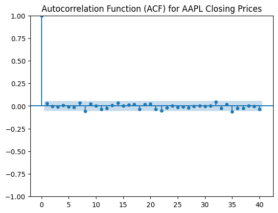
Stationary Data
Before we plot the stationary data, we need to transform the Apple data into a stationary format. To do this we will take the logartithm and then find the diff().
apple_stock_log = np.log(apple_stock)
apple_stock_diff = apple_stock_log.diff().dropna()
The plotting code is nearly identical as the nonstationary data. Instead we pass in a different set of data.
					plt.figure(figsize=(10,5))
plot_acf(apple_stock_diff, lags=40, markersize=4)
plt.title("Autocorrelation Function (ACF) for AAPL Closing Prices")
plt.show()
We know that this is stationary as there is an immediate dropoff after the 0 lag.