One of Streamlit powerful features is the ability to visualize data using charts.
we would focus on Bar chart in this article.
Need a Streamlit developer? Click Here
Basic Bar Chart
Streamlit provides a simple way to display bar chart using the st.bar_chart
we also have other ways using Altair, Ploty and matplotlib which we would look at later in this article
| Parameter | Type | Description |
|---|---|---|
| data | Anything supported by st.dataframe | The dataset to plot. |
| x | str or None | Column for x-axis. Uses index if None. |
| y | str, list[str], or None | Column(s) for y-axis. If None, plots all numeric columns. |
| x_label | str or None | Label for the x-axis. Defaults to column name. |
| y_label | str or None | Label for the y-axis. Defaults to column name(s). |
| color | str, tuple, list, or None | Color(s) for bars. Accepts hex, RGB, RGBA, or column-based grouping. |
| horizontal | bool | If True, bars are horizontal. Default is vertical. |
| stack | bool, "normalize", "center", "layered", or None | Controls bar stacking. Default is Streamlit’s auto mode. |
| width | int or None | Chart width in pixels. Requires use_container_width=False. |
| height | int or None | Chart height in pixels. Adjusts automatically if None. |
| use_container_width | bool | If True (default), chart fills the container width. |
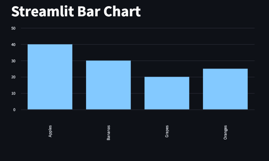
Example: Basic bar chart using st.bar_chart
pd.DataFrame(): Create data
set_index(): Streamlit uses index for categories
st.bar_chart(): Renders the chart automatically
					import pandas as pd
import streamlit as st

st.title("Streamlit Bar Chart")

data = pd.DataFrame({
    "Fruits": ["Apples", "Oranges", "Bananas", "Grapes"],
    "Quantity": [40, 25, 30, 20]
})

st.bar_chart(data.set_index("Fruits"))
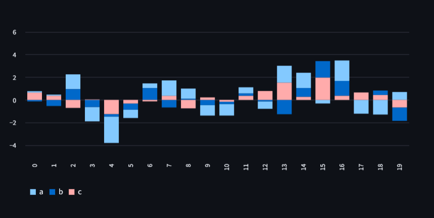
Here, we create a random data 20 rows and 3 columns then we display it in streamlit
rng(0).standard_normal((20, 3))
Generates a 20×3 matrix of random numbers (20 rows, 3 columns).
pd.DataFrame(…, columns=[“a”, “b”, “c”])
Turns that matrix into a DataFrame with column names a, b, c.
					import pandas as pd
import streamlit as st
from numpy.random import default_rng as rng

df = pd.DataFrame(rng(0).standard_normal((20, 3)), columns=["a", "b", "c"])

st.bar_chart(df)
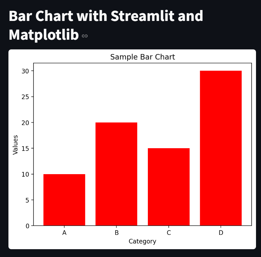
Basic Bar Chart with Streamlit and Matplotlib
Streamlit provides a simple way to display Matplotlib figures using the st.pyplot() function.
import streamlit as st
import pandas as pd
import matplotlib.pyplot as plt

st.title("Bar Chart with Streamlit and Matplotlib")

data = {
    "Category": ["A", "B", "C", "D"],
    "Values": [10, 20, 15, 30]
}

df = pd.DataFrame(data)

#Next we create the bar chart using Matplotlib
fig, ax = plt.subplots()
ax.bar(df["Category"], df["Values"], color="red")
ax.set_xlabel("Category")
ax.set_ylabel("Values")
ax.set_title("Sample Bar Chart")


#Then we display the chart with Streamlit
st.pyplot(fig)
st.bar_chart has little customization, for more customization of charts we use other libraries like Altair or Ploty
Customized Bar Chart with Altair
Ensure that altair is installed.
import altair as alt
import pandas as pd
import streamlit as st
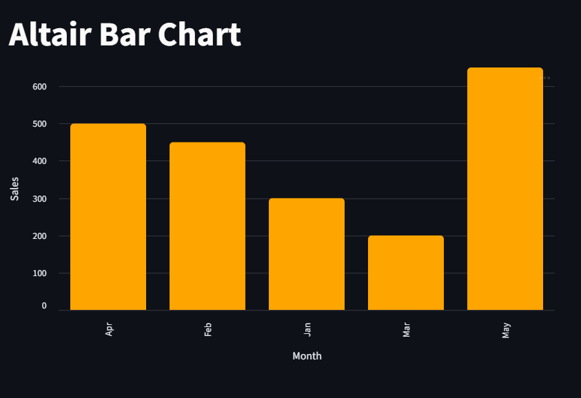
st.title("Altair Bar Chart")
df = pd.DataFrame({
"Month": ["Jan", "Feb", "Mar", "Apr", "May"],
"Sales": [300, 450, 200, 500, 650]
})
chart = (alt.Chart(df).mark_bar(color="orange", cornerRadiusTopLeft=5, cornerRadiusTopRight=5).encode(x="Month", y="Sales", tooltip=["Month", "Sales"]).properties(width=600, height=400))
st.altair_chart(chart, use_container_width=True)
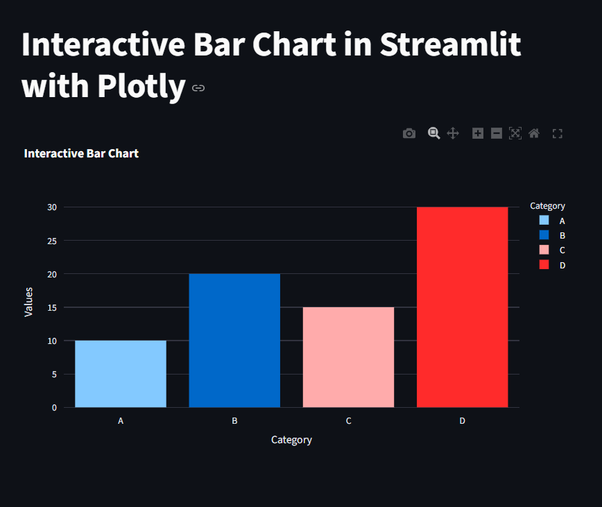
Customized Bar Chart with Ploty
Ensure ploty installed.
					import streamlit as st
import pandas as pd
import plotly.express as px


# Set the title of the Streamlit app
st.title("Interactive Bar Chart in Streamlit with Plotly")

# Sample data
data = {
    "Category": ["A", "B", "C", "D"],
    "Values": [10, 20, 15, 30]
}
df = pd.DataFrame(data)

# Create an interactive bar chart using Plotly Express
fig = px.bar(df, x="Category", y="Values", title="Interactive Bar Chart", color="Category")

# Display the chart in Streamlit
st.plotly_chart(fig, use_container_width=True)