In Scikit-Learn Gaussian Mixture Models allow you to represent clusters of data into multiple normal distributions.
This tutorial will walk you through two different examples of utilizing GMMs. We will go through one with generated blobs and another with baseball card values.
If you want to watch a video based around the tutorial, we have embedded one down below from our YouTube channel.
Tutorial Prep
Let’s start this tutorial by importing in all the dependencies.
					import numpy as np
from sklearn.mixture import GaussianMixture
from sklearn.datasets import make_blobs
import matplotlib.pyplot as plt
import seaborn as sns
import pandas as pd
Next, we will also will want to generate a few blobs.
data, true_labels = make_blobs(n_samples=300, centers=3, cluster_std=2.0, random_state=42)
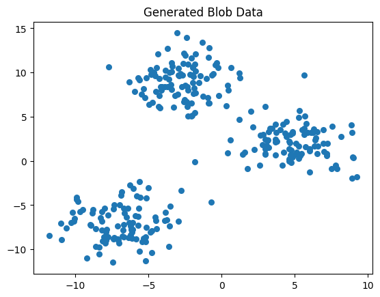
Let’s use a scatter plot to visualize the 3 distinct blobs.
					plt.scatter(data[:, 0], data[:, 1], s=30)
plt.title("Generated Blob Data")
plt.show()
Example 1 -
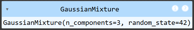
Let’s start our first Gaussian Mixture model example. Since we know there will be 3 blobs, we set n_components equal to 3. To replicate this in the future set a random state.
gmm = GaussianMixture(n_components=3, random_state=42)
Once we have the GMM created, we can use .fit and pass in the generated blob data from earlier.
gmm.fit(data)
predicted_labels = gmm.predict(data)
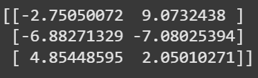
Let’s look at finding the means for each blobs center. We will want to graph these in a few minutes.
					cluster_centers = gmm.means_
print(cluster_centers)
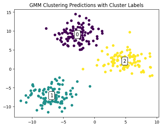
					plt.scatter(data[:, 0], data[:, 1], c=predicted_labels, cmap='viridis', s=30, label='Cluster Points')

# Annotate cluster centers with their labels
for idx, (x, y) in enumerate(cluster_centers):
    plt.text(x, y, str(idx), color="black", fontsize=12, ha="center", va="center",
             bbox=dict(facecolor='white', edgecolor='black', boxstyle='round,pad=0.3'))

# Add title and legend
plt.title("GMM Clustering Predictions with Cluster Labels")
plt.show()
Let’s test a point to see which blob it’ll be a part of.
new_point = [[0, 3]]
					predicted_cluster = gmm.predict(new_point)
print(f"The point {new_point} is predicted to belong to cluster {predicted_cluster[0]}")
The point [[0, 3]] is predicted to belong to cluster 2
					probabilities = gmm.predict_proba(new_point)
print(f"Probabilities for each cluster: {probabilities}")
Probabilities for each cluster: [[3.65071761e-02 6.71974709e-07 9.63492152e-01]]
Example 2 -
np.random.seed(42)
This code will generate the first cluster of 300 cards around 5,000 in value. We remove any value that is under 0 as baseball cards cannot have a negative value.
					cluster_1 = np.random.normal(loc=5000, scale=2500, size=300)
cluster_1 = cluster_1[cluster_1 > 0]
This code will generate the first cluster of 100 cards around 20,000 in value. We remove any value that is under 0 as baseball cards cannot have a negative value.
					cluster_2 = np.random.normal(loc=20000, scale=5000, size=100)
cluster_2 = cluster_2[cluster_2 > 0]
Let’s combine these together now.
prices = np.concatenate([cluster_1, cluster_2]).reshape(-1, 1)
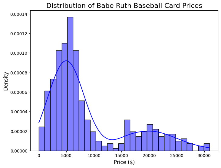
Let’s plot a histogram with a kde. This will show us the two normal distributions that are combined.
					prices_flat = prices.flatten()

# Plot the histogram with KDE
plt.figure(figsize=(8, 6))
sns.histplot(prices_flat, kde=True, bins=30, color='blue', edgecolor='black', stat='density')

# Add titles and labels
plt.title("Distribution of Babe Ruth Baseball Card Prices", fontsize=16)
plt.xlabel("Price ($)", fontsize=12)
plt.ylabel("Density", fontsize=12)
plt.show()
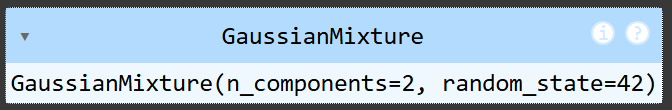
Since we only have two gaussian distributions, we set n_components =2. Again lets set a random state.
gmm = GaussianMixture(n_components=2, random_state=42)
We fit once again with the data we are using, this time the card prices.
gmm.fit(prices)
predicted_labels = gmm.predict(prices)
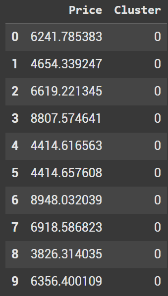
					data_df = pd.DataFrame({
    'Price': prices.flatten(),
    'Cluster': predicted_labels
})
data_df.head(10)
When looking at the first 10 results, we see they are all part of cluster 0. This makes sense as they are all smaller values.
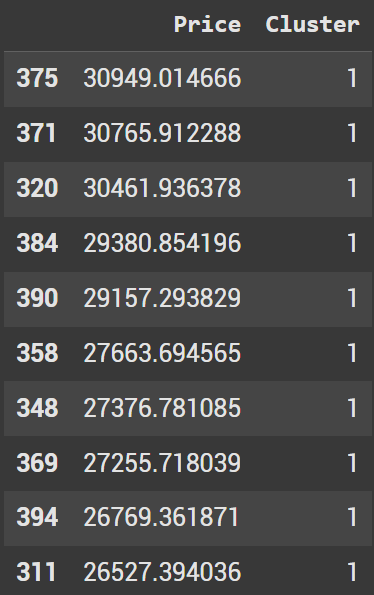
Let’s sort by prices in descending order. We should make sure these are all part of the 2nd cluster (cluster 1).
					top_expensive = data_df.sort_values(by='Price', ascending=False)
top_expensive.head(10)
And just like that we went through two different examples of using GMM.
