principal component analysis scikit learn
PCA (Principal Component Analysis) in Python using Scikit-learn is a technique used to reduce the number of features in a dataset while preserving most of the variance (information).
It works by:
Finding new axes (principal components) that capture the most variance.
Projecting the data onto these fewer dimensions.
It’s useful for visualization, speeding up models, and removing noise.
We start by importing pandas and numpy.
import pandas as pd
import numpy as np
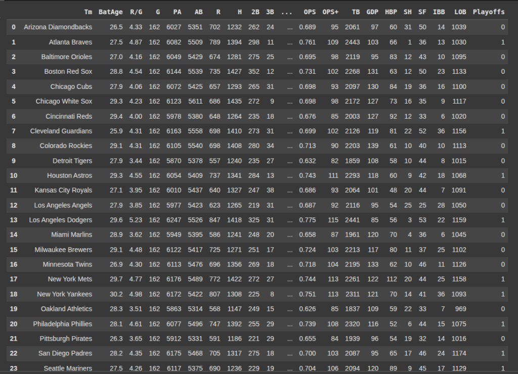
Next we read our data set ‘2022mlbteams.csv’
df = pd.read_csv('2022mlbteams.csv')
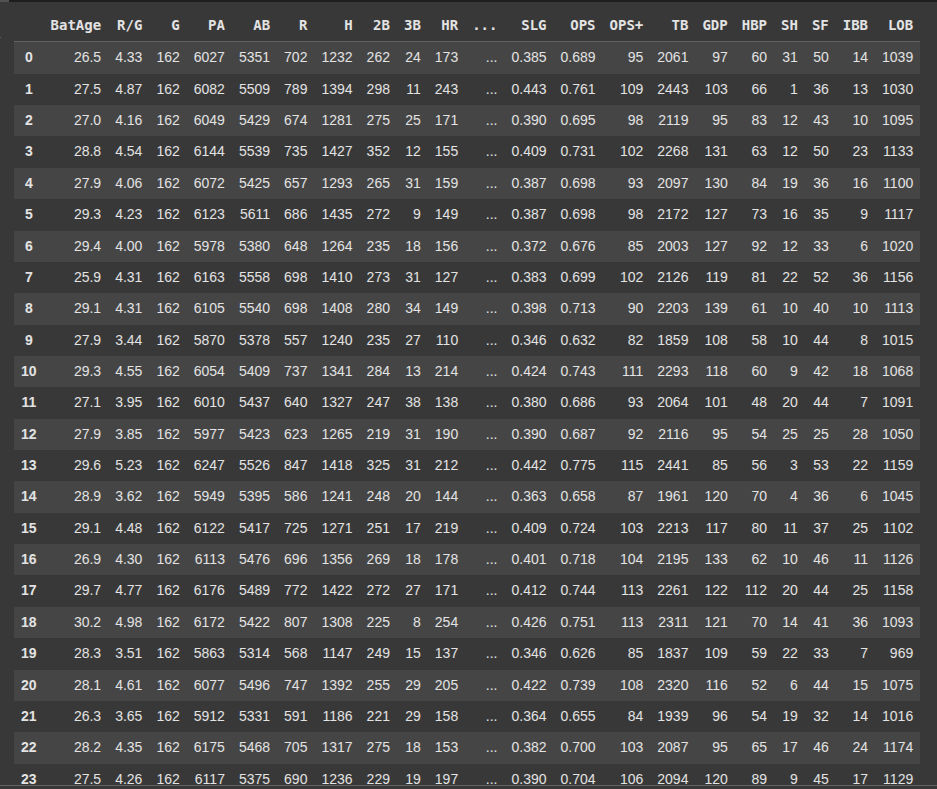
Then we remove the column ‘Tm’ from the DataFrame df.
axis=1 means we are dropping a column not a row.
inplace=True means the chnages is made directly to df without the need to assign it back.
df.drop('Tm', axis=1, inplace=True)
Here we selct the columns 0 to 26 from the DataFrame df and assign them to X.
This would be used as the features matric or input data.
X = df.iloc[:, 0:27]
Here we select columns 27 i.e the 28th column from df and we assign it to y, which would be used as the target or output variable.
y = df.iloc[:,27]
Next we import train_test_split from sklearn, which is used to split the dataset df into training and testing sets.
from sklearn.model_selection import train_test_split
X_train, X_test, y_train, y_test = train_test_split(X, y, test_size=0.2, random_state=21)
Here we import StandardScaler which is used to standardize or normalize features so that they have a mean of 0 and a standard deviation of 1.
from sklearn.preprocessing import StandardScaler
Then we assign the StandardScaler to ‘scaleStandard’
scaleStandard = StandardScaler()
Next we use the .fit_transform() method to calculate the mean and standard deviation of each feature in X-train, then we also standardize the data.
X_train = scaleStandard.fit_transform(X_train)
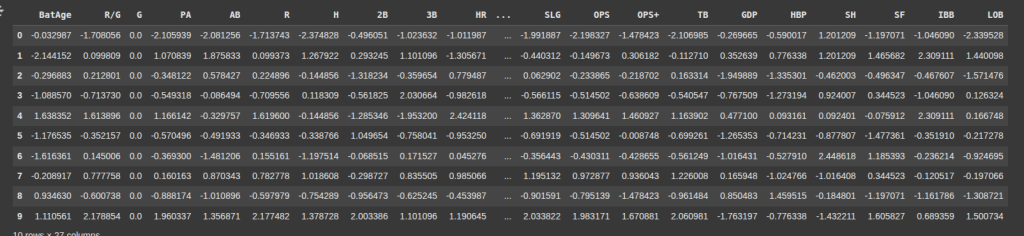
Here, we convert the standardize X_train back into a Pandas DataFrame, and assign column names to it.
					X_train = pd.DataFrame(X_train, columns =['BatAge', 'R/G', 'G', 'PA', 'AB', 'R', 'H', '2B', '3B', 'HR', 'RBI',
       'SB', 'CS', 'BB', 'SO', 'BA', 'OBP', 'SLG', 'OPS', 'OPS+', 'TB', 'GDP',
       'HBP', 'SH', 'SF', 'IBB', 'LOB'])
X_train.head(10)
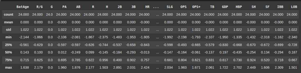
X_train.describe().round(3)
Next we import PCA (Principal Component Analysis) from sklearn.decompositon.
Then we assign PCA() to pca1
from sklearn.decomposition import PCA
pca1 = PCA()
Here we fit the model to X_train so it learns the directions of maximum variance.
Then transforms X_train into a new set of features (principal components)
X_pca1 = pca1.fit_transform(X_train)
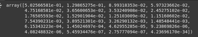
.explained_variance_ratio_ shows the proportion of variance each principal component explains.
pca1.explained_variance_ratio_
Prasad Ostwal Github
Here we import matplotlib.pyplot as plt.
import matplotlib.pyplot as plt
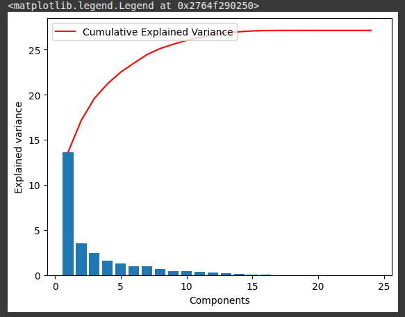
This block of code visualizes how much variance each PCA component explains and how much is cumulatively explained.
					plt.bar(range(1,len(pca1.explained_variance_ )+1),pca1.explained_variance_ )
plt.ylabel('Explained variance')
plt.xlabel('Components')
plt.plot(range(1,len(pca1.explained_variance_ )+1),
         np.cumsum(pca1.explained_variance_),
         c='red',
         label="Cumulative Explained Variance")
plt.legend(loc='upper left')
					plt.plot(pca1.explained_variance_ratio_)
plt.xlabel('number of components')
plt.ylabel('cumulative explained variance')
plt.show()
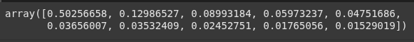
pca2 = PCA(0.95)
Once again we fit_transform().
X_pca2 = pca2.fit_transform(X_train)
X_pca2.shape
pca2.explained_variance_ratio_
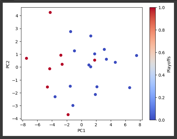
This line creates a PCA object that will reduce the data to exactly 2 principal components:
To simplify the data to just 2 dimensions.
Commonly used for visualization (e.g., 2D scatter plots of high-dimensional data).
Retains the 2 directions with the most variance in the dataset.
pca2c = PCA(n_components=2)
We also fit_transform()
X_pca2c = pca2c.fit_transform(X_train)
Next we get the coolwarm colormap from matplotlib.
So we can use it to plot.
colormap = plt.cm.get_cmap('coolwarm')
					plt.figure()
scatter = plt.scatter(X_pca2c[:, 0], X_pca2c[:, 1], c=y_train, cmap=colormap)
plt.xlabel('PC1')
plt.ylabel('PC2')
plt.colorbar(scatter, label='Playoffs')
plt.show()
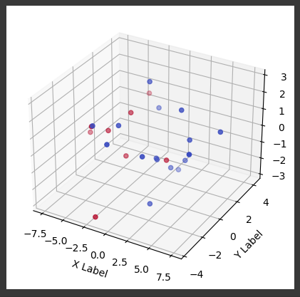
Here we create a PCA object that will reduce the dataset to 3 principal components.
To simplify the data while keeping the 3 directions with the most variance.
Useful for:
3D visualization
Further dimensionality reduction before modeling
Preserving more variance than 2 components while still reducing complexity.
pca3c = PCA(n_components=3)
We fit_transform() as usual.
X_pca3c = pca3c.fit_transform(X_train)
pca3c.explained_variance_ratio_
					from mpl_toolkits.mplot3d import Axes3D  # Import the 3D plotting toolkit

# Create a figure and a 3D axis
fig = plt.figure()
ax = fig.add_subplot(111, projection='3d')

# Create the 3D scatter plot
ax.scatter(X_pca3c[:,0], X_pca3c[:,1], X_pca3c[:,2], c=y_train, cmap=colormap)

# Set labels for the axes
ax.set_xlabel('X Label')
ax.set_ylabel('Y Label')
ax.set_zlabel('Z Label')

# Show the plot
plt.colorbar(scatter, label='Playoffs')
plt.show()
Ryan is a Data Scientist at a fintech company, where he focuses on fraud prevention in underwriting and risk. Before that, he worked as a Data Analyst at a tax software company. He holds a degree in Electrical Engineering from UCF.