Streamlit Charts
Streamlit allows us to view data(data visualization).
It provides simple API’s for data visualization and supports both built-in charts and third party libraries
Streamlit also have interactive charting libraries live Vega Lite(2D charts) and deck.gl(maps and 3D charts)
and it provides chart types that are native to Streamlit, like st.line_chart and st.area_chart
Need a Streamlit? Click Here
Built-in Streamlit Charts
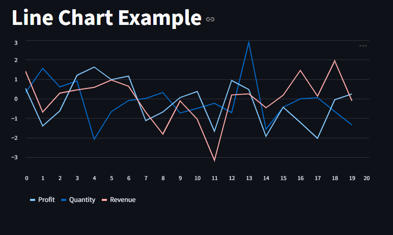
let’s make use of st.line_chart()
This chart type is best for time-series trends.
					import streamlit as st
import pandas as pd
import numpy as np


st.title("Line Chart Example")

data = pd.DataFrame(np.random.randn(20, 3), columns=["Quantity", "Profit", "Revenue"])

st.line_chart(data)
Area Chart
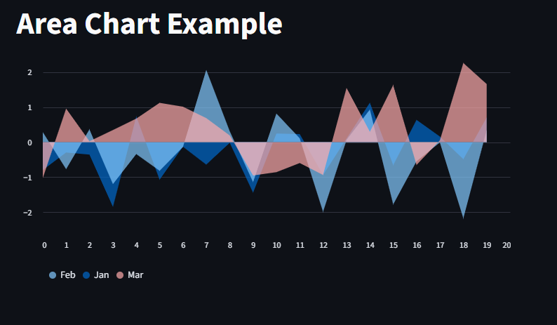
lets also plot with st.area_chart()
					import streamlit as st
import pandas as pd
import numpy as np

st.title("Area Chart Example")

data = pd.DataFrame(np.random.randn(20, 3), columns=["Jan", "Feb", "Mar"])
st.area_chart(data)
Bar Chart
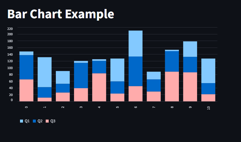
we use the st.bar_chart to plot bar charts in Streamli
					import streamlit as st
import pandas as pd
import numpy as np

st.title("Bar Chart Example")

data = pd.DataFrame(np.random.randint(1, 100, size=(11, 3)), columns=["Q1", "Q2", "Q3"])
st.bar_chart(data)
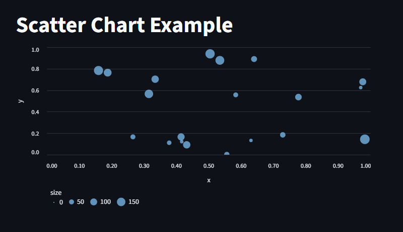
Scatter Chart
					import streamlit as st
import pandas as pd
import numpy as np

st.title("Scatter Chart Example")

data = pd.DataFrame({
    "x": np.random.rand(20),
    "y": np.random.rand(20),
    "size": np.random.randint(20, 200, 20)
})

st.scatter_chart(data, x="x", y="y", size="size")
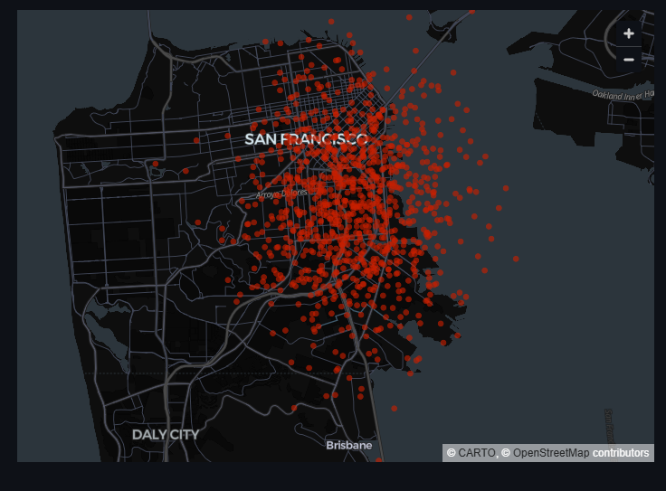
Scatterplots on maps
Here, we plot a Scatterplot with San Francisco as the base coordinate
rng(0) initializes a random number generator with seed= 0, this ensures reproducible results, so every time we run the code, we get the same result
standard_normal generates 1,000 rows and 2 columns of numbers from a standard normal distribution (mean = 0, std = 1).
Shape: (1000, 2): First column for latitude offset, second for longitude offset.
[50, 50] This divides all values by 50 to make the random offsets small so the points stay near a central location.
columns=[“lat”, “lon”] labels the two columns as latitude and longitude.
					import pandas as pd
import streamlit as st
from numpy.random import default_rng as rng

df = pd.DataFrame(
    rng(0).standard_normal((1000, 2)) / [50, 50] + [37.76, -122.4],
    columns=["lat", "lon"],
)

st.map(df)
Advanced chart elements
let’s also look at more advanced charts with external libraries.
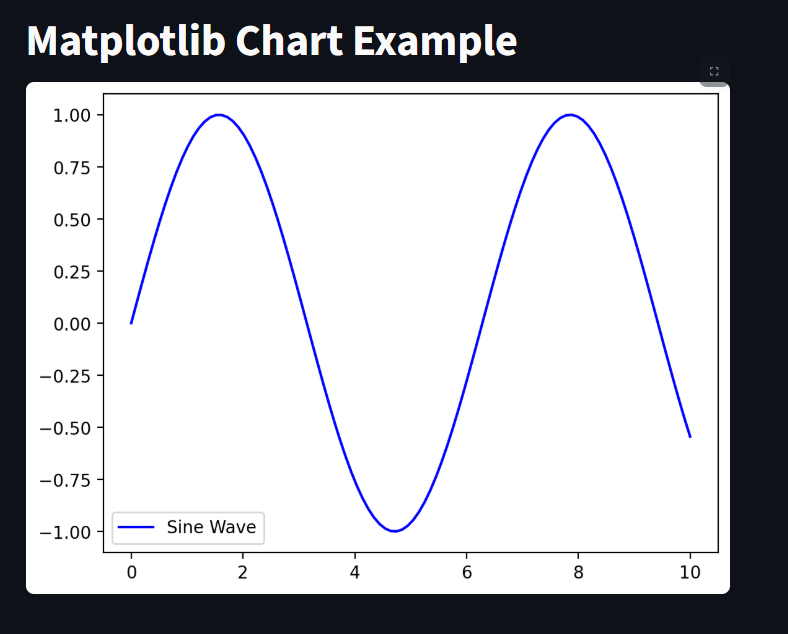
Matplotlib Charts
This displays a matplotlib.pyplot figure.
					import streamlit as st
import matplotlib.pyplot as plt
import numpy as np


st.title("Matplotlib Chart Example")

x = np.linspace(0, 10, 100)
y = np.sin(x)

fig, ax = plt.subplots()
ax.plot(x, y, label="Sine Wave", color="blue")
ax.legend()

st.pyplot(fig)
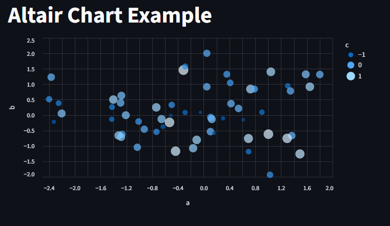
Altair Charts
This displays a chart using the Altair library
					import altair as alt
import pandas as pd
import streamlit as st
from numpy.random import default_rng as rng


st.title("Altair Chart Example")

df = pd.DataFrame(rng(0).standard_normal((60, 3)), columns=["a", "b", "c"])

chart = (
    alt.Chart(df)
    .mark_circle()
    .encode(x="a", y="b", size="c", color="c", tooltip=["a", "b", "c"])
)

st.altair_chart(chart)
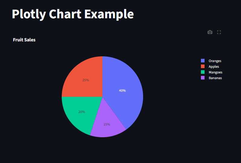
Plotly Chart
This displays a chart using the Plotly library
					import streamlit as st
import plotly.express as px
import pandas as pd

st.title("Plotly Chart Example")

df = pd.DataFrame({
    "Fruit": ["Apples", "Oranges", "Bananas", "Mangoes"],
    "Sales": [25, 40, 15, 20]
})

fig = px.pie(df, names="Fruit", values="Sales", title="Fruit Sales")
st.plotly_chart(fig, use_container_width=True)
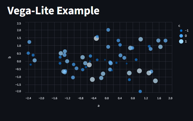
Vega-Lite
This displays a chart using the Vega-Lite library
					import pandas as pd
import streamlit as st
from numpy.random import default_rng as rng

st.title("Vega-Lite Example")
df = pd.DataFrame(rng(0).standard_normal((60, 3)), columns=["a", "b", "c"])

st.vega_lite_chart(
    df,
    {
        "mark": {"type": "circle", "tooltip": True},
        "encoding": {
            "x": {"field": "a", "type": "quantitative"},
            "y": {"field": "b", "type": "quantitative"},
            "size": {"field": "c", "type": "quantitative"},
            "color": {"field": "c", "type": "quantitative"},
        },
    },
)
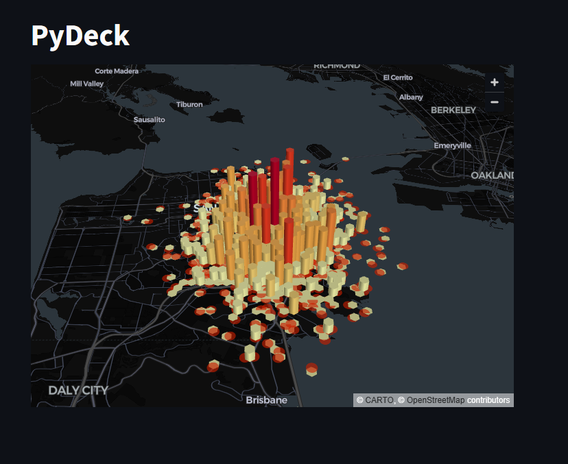
PyDeck
This displays a chart using the PyDeck library
					import pandas as pd
import pydeck as pdk
import streamlit as st
from numpy.random import default_rng as rng


st.title("PyDeck")
df = pd.DataFrame(
    rng(0).standard_normal((1000, 2)) / [50, 50] + [37.76, -122.4],
    columns=["lat", "lon"],
)

st.pydeck_chart(
    pdk.Deck(
        map_style=None,  # Use Streamlit theme to pick map style
        initial_view_state=pdk.ViewState(
            latitude=37.76,
            longitude=-122.4,
            zoom=11,
            pitch=50,
        ),
        layers=[
            pdk.Layer(
                "HexagonLayer",
                data=df,
                get_position="[lon, lat]",
                radius=200,
                elevation_scale=4,
                elevation_range=[0, 1000],
                pickable=True,
                extruded=True,
            ),
            pdk.Layer(
                "ScatterplotLayer",
                data=df,
                get_position="[lon, lat]",
                get_color="[200, 30, 0, 160]",
                get_radius=200,
            ),
        ],
    )
)
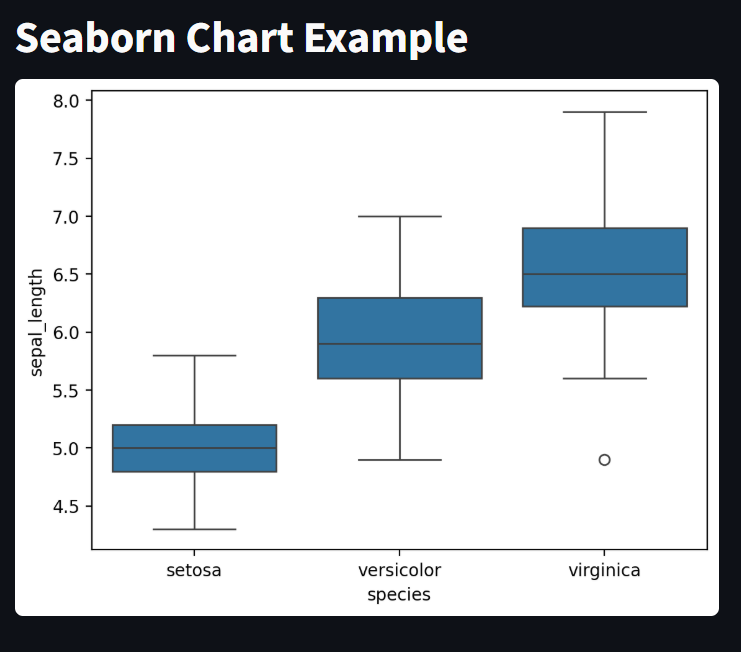
Seaborn Charts
This displays a chart using seaborn library
					import streamlit as st
import seaborn as sns
import pandas as pd
import matplotlib.pyplot as plt

st.title("Seaborn Chart Example")

df = sns.load_dataset("iris")
fig, ax = plt.subplots()
sns.boxplot(x="species", y="sepal_length", data=df, ax=ax)

st.pyplot(fig)
Interactive Chart
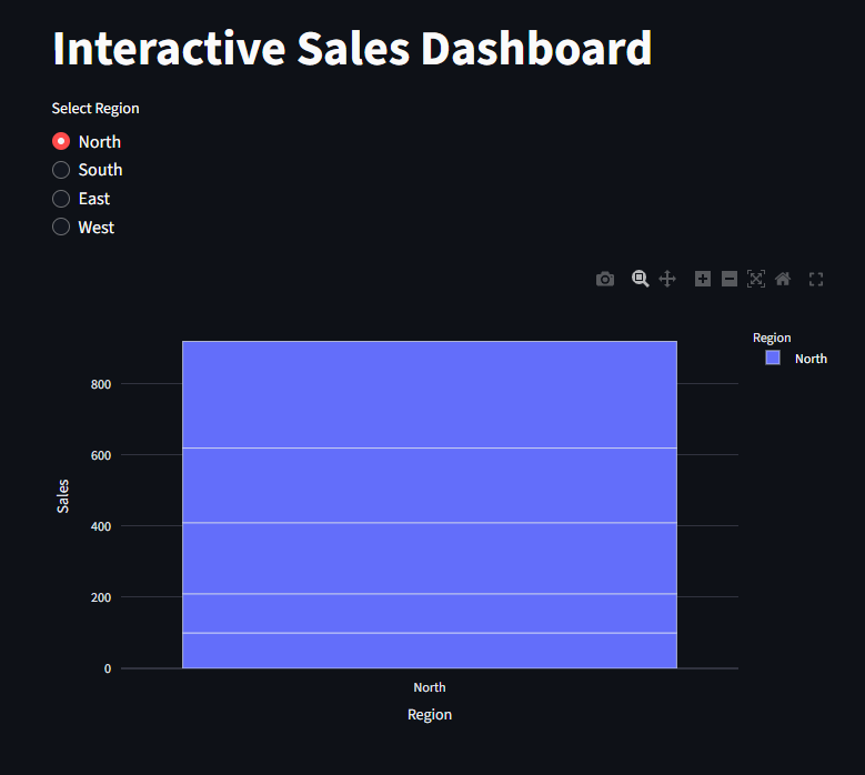
Here, we create an interactive chart where we select the region and the chart updates and the data matches the selected region
import streamlit as st
					import streamlit as st
import pandas as pd
import plotly.express as px

st.title("Interactive Sales Dashboard")
df = pd.DataFrame({
    "Region": ["North", "South", "East", "West"] * 5,
    "Sales": [100, 150, 120, 130, 110, 140, 160, 180, 200, 220,
              170, 190, 210, 230, 250, 270, 300, 320, 350, 400]
})

region = st.radio("Select Region", df["Region"].unique()
                  )
filtered_df = df[df["Region"] == region]
fig = px.bar(filtered_df, x="Region", y="Sales", color="Region")
st.plotly_chart(fig, use_container_width=True)
