Users can enable or inhibit a binary option in your application using the Streamlit st.toggle() widget.
It functions similarly to a switch button, yielding a boolean value (True or False).
Need a Streamlit developer? Click Here
Syntax
st.toggle(label, value=False, key=None, help=None, on_change=None, args=None, kwargs=None, *, disabled=False, label_visibility=”visible”, width=”content”)
| Parameter | Type | Default | Description |
|---|---|---|---|
| label | str | Required | The text label displayed next to the toggle switch. Used to describe the purpose of the toggle. |
| value | bool | False | Sets the initial state of the toggle. True = ON, False = OFF. |
| key | str or int | None | A unique key that identifies the widget. Useful when you have multiple toggles in the same app to manage their states independently. |
| help | str | None | Adds a small tooltip icon next to the toggle. When hovered, it displays the provided text. |
| on_change | callable | None | A function to execute whenever the toggle value changes. Useful for callbacks and dynamic updates. |
| args | tuple | None | A tuple of positional arguments passed to the on_change callback function. |
| kwargs | dict | None | A dictionary of keyword arguments passed to the on_change callback function. |
| disabled | bool | False | If True, the toggle is read-only and cannot be changed by the user. |
| label_visibility | str | "visible" | Controls whether the label is shown. Options: • “visible” → Label always shown. • “hidden” → Label hidden but space reserved. • “collapsed” → Label hidden and space removed. |
| width | str | "content" | Controls toggle’s width. Options: • “content” → Width fits toggle & label. • “stretch” → Toggle stretches across available space. |
Basic Example
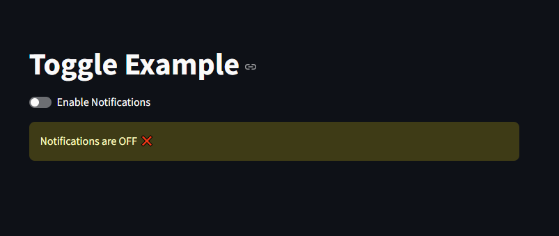
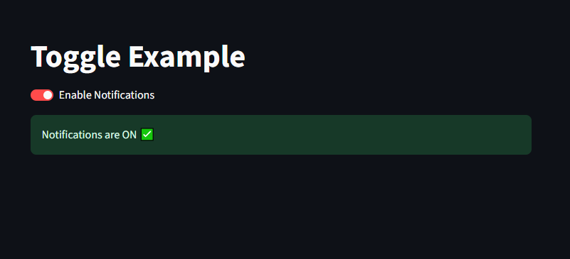
If the user turns the toggle ON, status becomes True.
If the toggle is OFF, status becomes False.
					import streamlit as st

st.title("Toggle Example")

status = st.toggle("Enable Notifications")

if status:
    st.success("Notifications are ON ✅")
else:
    st.warning("Notifications are OFF ❌")
Using Default Values
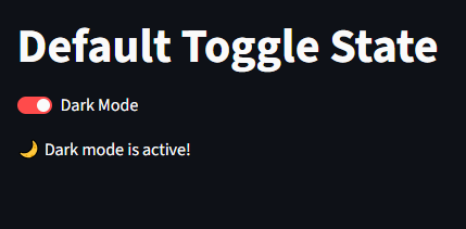
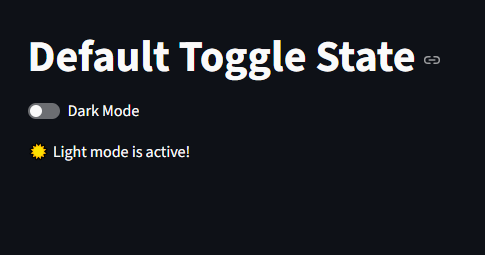
we can set default value by setting the “value” to either true or false
					import streamlit as st

st.title("Default Toggle State")

theme = st.toggle("Dark Mode", value=True)

if theme:
    st.write("🌙 Dark mode is active!")
else:
    st.write("☀️ Light mode is active!")
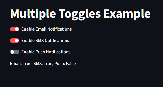
Multiple Toggles
we can set multiple toggles. It is useful when managing multiple preferences.
					import streamlit as st

st.title("Multiple Toggles Example")

email = st.toggle("Enable Email Notifications")
sms = st.toggle("Enable SMS Notifications")
push = st.toggle("Enable Push Notifications")

st.write(f"Email: {email}, SMS: {sms}, Push: {push}")
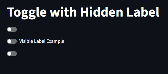
Custom Label Visibility
| Option | Effect |
|---|---|
"visible" | Shows label normally |
"hidden" | Hides label but keeps space |
"collapsed" | Hides label completely |
					import streamlit as st

st.title("Toggle with Hidden Label")

st.toggle("Hidden Label Example", label_visibility="collapsed")
st.toggle("Visible Label Example", label_visibility="visible")
st.toggle("Hidden but Space Preserved", label_visibility="hidden")
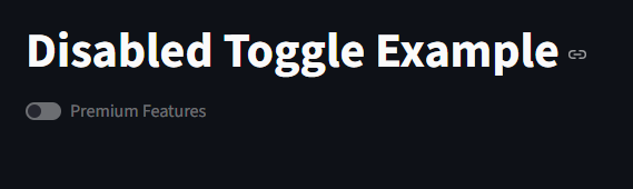
Disabled Toggles
we can disable toggles by disabled=True
					import streamlit as st

st.title("Disabled Toggle Example")

st.toggle("Premium Features", disabled=True)
Summary
st.toggle() is a boolean switch widget in Streamlit.
Perfect for preferences, feature flags, and settings.
Supports callbacks, state persistence, and dynamic updates.
Can be combined with other widgets to create interactive dashboards.
Learn more about Streamlit: Click Here
Watch Videos on Streamlit:
