Streamlit Plotly
Plotly is a charting library for Python, used for building interactive and animated data visualizations
Streamlit supports Plotly through the st.plotly_chart() function.
This function takes a Plotly figure object as input and renders it in the Streamlit app.
You can create a variety of charts using Plotly, including line charts, bar charts, scatter plots, pie charts, and more.
Plotly is particularly well-suited for creating complex, interactive visualizations that require user interaction, such as zooming, panning, and hovering over data points to see additional information.
Need a Streamlit developer? Click Here
Syntax
st.plotly_chart(figure_or_data, use_container_width=True, *, theme=”streamlit”, key=None, on_select=”ignore”, selection_mode=(‘points’, ‘box’, ‘lasso’), **kwargs)
| Parameter | Type | Default | Description |
|---|---|---|---|
| figure_or_data | plotly.graph_objs.Figure / dict | Required | The Plotly figure object or data to display. Usually created using Plotly Express or Plotly Graph Objects. |
| use_container_width | bool | False | If True, the chart automatically expands to fit the width of the Streamlit app container. |
| theme | str | "streamlit" | The theme applied to the chart. Use "streamlit" for Streamlit’s default theme or "plotly" to use Plotly’s native theme. |
| key | str / int | None | An optional unique key for the chart widget. Useful when displaying multiple charts dynamically. |
| on_select | str | "ignore" | Defines what happens when users select points on the chart. Options: "ignore" (default), "rerun", or "never". |
| selection_mode | tuple / list | ('points', 'box', 'lasso') | Determines the allowed selection modes for users. You can enable one or multiple: • "points" → Select individual points • "box" → Select by dragging a rectangular box • "lasso" → Select freeform points |
| **kwargs | dict | None | Additional Plotly figure customization options, like layout, config, etc. |
Installing Plotly
To use Plotly with Streamlit, you need to install the Plotly library.
You can do this using pip:
pip install plotly
You can install all charting libraries at once using:
pip install “streamlit[charts]”
Basic example
					import streamlit as st
import plotly.express as px
import pandas as pd


# Create a sample DataFrame
data = pd.DataFrame({
    'Category': ['A', 'B', 'C', 'D'],
    'Values': [10, 20, 30, 40]
})

# Create a bar chart using Plotly
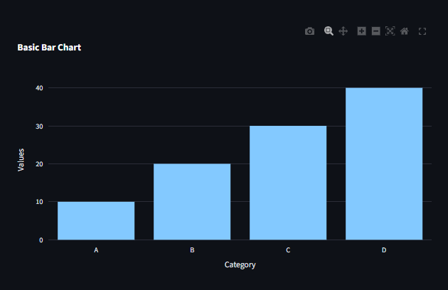
fig = px.bar(data, x='Category', y='Values', title='Basic Bar Chart')

# Display the chart in Streamlit
st.plotly_chart(fig, use_container_width=True)
Line Chart Example
					import streamlit as st
import plotly.express as px
import pandas as pd

# Create a sample DataFrame
data = pd.DataFrame({
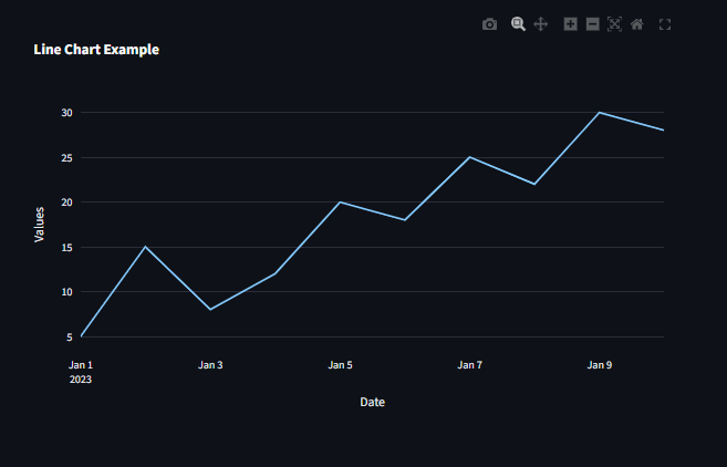
    'Date': pd.date_range(start='2023-01-01', periods=10, freq='D'),
    'Values': [5, 15, 8, 12, 20, 18, 25, 22, 30, 28]
})

# Create a line chart using Plotly
fig = px.line(data, x='Date', y='Values', title='Line Chart Example')
# Display the chart in Streamlit
st.plotly_chart(fig, use_container_width=True)
Scatter Plot Example
					import streamlit as st
import plotly.express as px
import pandas as pd

# Create a sample DataFrame
data = pd.DataFrame({
    'X': [1, 2, 3, 4, 5],
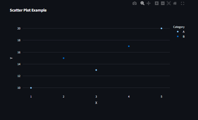
    'Y': [10, 15, 13, 17, 20],
    'Category': ['A', 'B', 'A', 'B', 'A']
})
# Create a scatter plot using Plotly
fig = px.scatter(data, x='X', y='Y', color="Category", size_max=10 , title='Scatter Plot Example')
# Display the chart in Streamlit
st.plotly_chart(fig, use_container_width=True)
Pie Chart Example
					import streamlit as st
import plotly.express as px
import pandas as pd

# Create a sample DataFrame

df = pd.DataFrame({
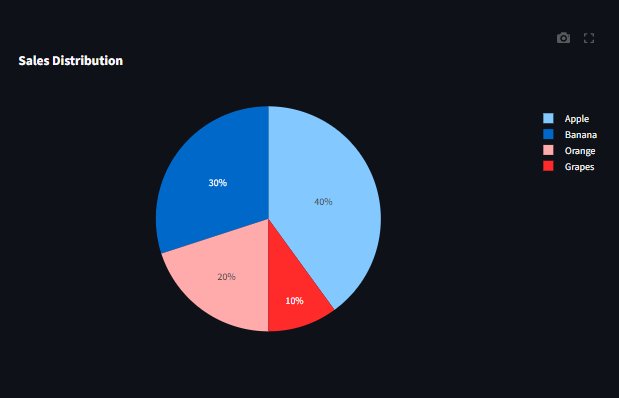
    "Fruit": ["Apple", "Banana", "Orange", "Grapes"],
    "Sales": [40, 30, 20, 10]
})

# Create a pie chart using Plotly
fig = px.pie(df, names="Fruit", values="Sales", title="Sales Distribution")

# Display the chart in Streamlit
st.plotly_chart(fig, use_container_width=True)
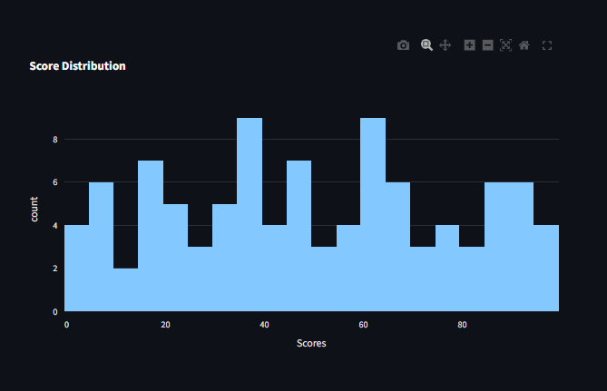
Histogram Example
					import streamlit as st
import plotly.express as px
import numpy as np
import pandas as pd


#Create a sample DataFrame
df = pd.DataFrame({"Scores": np.random.randint(0, 100, 100)})

#Create a histogram using Plotly
fig = px.histogram(df, x="Scores", nbins=20, title="Score Distribution")

#Display the chart in Streamlit
st.plotly_chart(fig, use_container_width=True)
Box Plot Example
					import streamlit as st
import plotly.express as px
import pandas as pd

# Create a sample DataFrame
df = pd.DataFrame({
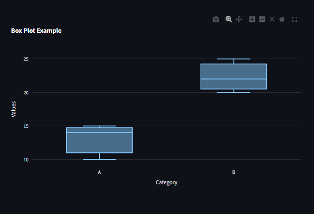
    "Category": ["A", "A", "A", "B", "B", "B"],
    "Values": [10, 15, 14, 20, 25, 22]
})

# Create a box plot using Plotly
fig = px.box(df, x="Category", y="Values", title="Box Plot Example")

# Display the chart in Streamlit
st.plotly_chart(fig, use_container_width=True)
Customizing Plotly Charts
You can customize the appearance of your Plotly charts using various parameters and methods provided by Plotly.
For example, you can change colors, add titles, modify axes, and more.
Refer to the Plotly documentation for more details on customization options: https://plotly.com/python/
Layout Options
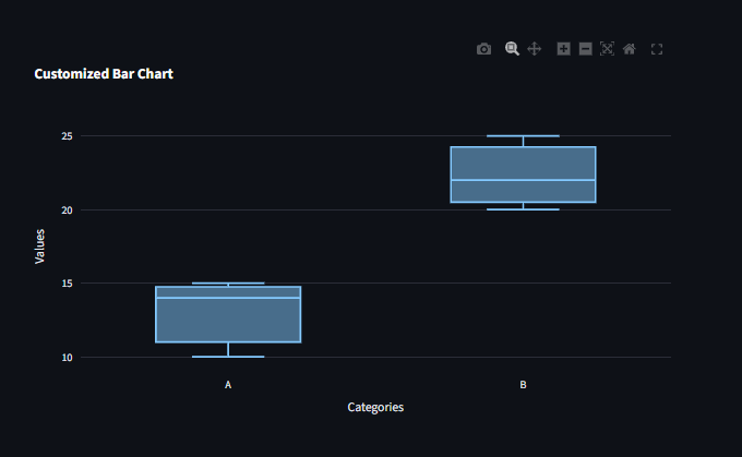
You can customize the layout of your Plotly charts using the update_layout() method.
					fig.update_layout(
    title="Customized Bar Chart",
    xaxis_title="Categories",
    yaxis_title="Values",
    legend_title="Legend"
)

st.plotly_chart(fig, use_container_width=True)
Interactivity
Plotly charts are interactive by default, allowing users to zoom, pan, and hover over data points to see additional information.
You can further enhance interactivity by adding features like dropdowns, sliders, and buttons using Plotly’s built-in capabilities.
Refer to the Plotly documentation for more details on adding interactivity: https://plotly.com/python/interactive-graphs/
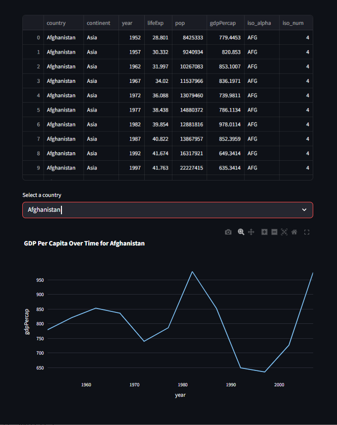
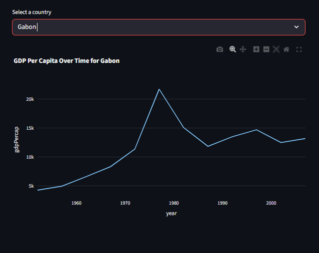
Interactive Dropdown for Dynamic Plots
					import plotly.graph_objects as go
import streamlit as st
import pandas as pd


# Load a sample dataset
df = px.data.gapminder()

#view the first 10 dataset
st.write(df[:11])

country = st.selectbox("Select a country", df['country'].unique())
filtered_data = df[df['country'] == country]

fig = px.line(filtered_data, x='year', y='gdpPercap', title=f'GDP Per Capita Over Time for {country}')

st.plotly_chart(fig, use_container_width=True)
Working with complicated data
Plotly is particularly well-suited for creating complex visualizations that require user interaction, such as zooming, panning, and hovering over data points to see additional information.
You can create a variety of charts using Plotly, including line charts, bar charts,
scatter plots, pie charts, and more.
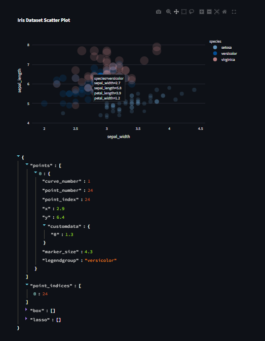
When working with more complicated graphs, the points attribute displays additional information.
					import plotly.express as px
import streamlit as st


# Load a sample dataset
df = px.data.iris()


fig = px.scatter(df, x='sepal_width', y='sepal_length', color='species', size='petal_length',
                 hover_data=['petal_width'], title='Iris Dataset Scatter Plot')


event = st.plotly_chart(fig, use_container_width=True, on_select="rerun")#The hover_data parameter allows you to specify additional columns from the DataFrame to display when hovering over points on the scatter plot.

event.selection
Best Practices for Using Plotly with Streamlit
Prefer Plotly Express → Ideal for creating quick and simple visualizations with minimal code.
Use Plotly Graph Objects → Best for advanced customization and complex visualizations.
Cache Large Datasets → Use
@st.cache_datato improve performance and reduce redundant computations.Make Charts Responsive → Set
use_container_width=Trueto ensure charts automatically adjust to the app layout.Enhance Interactivity → Always include filters, dropdowns, and selection options to make dashboards dynamic and user-friendly.
Learn more about Streamlit: Click Here
Watch Videos on Streamlit:
