Streamlit Line Chart
A line chart visualization component for Streamlit
st.line_chart() is used to create simple line charts from data.
It is a high-level API that abstracts away the complexities of chart creation.
Streamlit uses Altair under the hood for rendering line charts.
The line chart is interactive, allowing users to hover over points to see values.
It is particularly useful for visualizing trends over time or continuous data.
Need a Streamlit developer? Click Here
Syntax
st.line_chart(data=None, *, x=None, y=None, x_label=None, y_label=None, color=None, width=None, height=None, use_container_width=True) | |||||||||||||||||||||||||||||||
|---|---|---|---|---|---|---|---|---|---|---|---|---|---|---|---|---|---|---|---|---|---|---|---|---|---|---|---|---|---|---|---|
| |||||||||||||||||||||||||||||||
Getting Our Data Ready
st.line_chart() can accept a Pandas DataFrame, a NumPy array, or a list of lists.
If using a DataFrame, the index is used for the x-axis by default, and all numeric columns are plotted.
You can also specify which columns to use for the x and y axes.
Basic Example
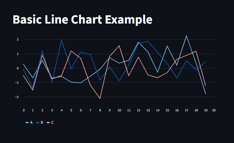
Here, we use Pandas to create a simple DataFrame and then visualize it using st.line_chart().
					import streamlit as st
import pandas as pd
import numpy as np


# Create a sample DataFrame
data = pd.DataFrame(
    np.random.randn(20, 3),
    columns=['A', 'B', 'C']
)

st.title("Basic Line Chart Example")
st.line_chart(data)
Customizing Axes
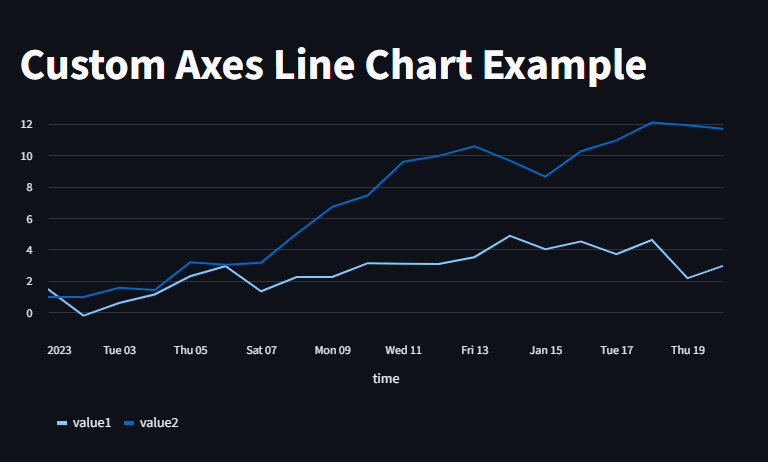
You can specify which columns to use for the x and y axes using the **x** and **y** parameters.
					data = pd.DataFrame({
    'time': pd.date_range(start='1/1/2023', periods=20),
    'value1': np.random.randn(20).cumsum(),
    'value2': np.random.randn(20).cumsum()
})
st.title("Custom Axes Line Chart Example")
st.line_chart(data, x='time', y=['value1', 'value2'])
Adjusting Size
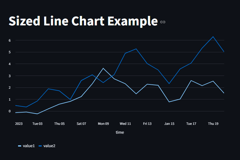
You can control the size of the chart using the **width** and **height** parameters.
					st.title("Sized Line Chart Example")
st.line_chart(data, x='time', y=['value1', 'value2'], width=600, height=400)
st.line_chart(data, x='time', y=['value1', 'value2'], use_container_width=True)  # Stretches to fit page width
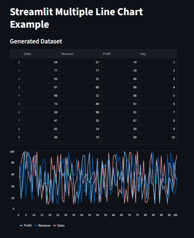
You can also plot multiple lines by passing a DataFrame with multiple numeric columns.
Each column will be represented as a separate line on the chart.
					import streamlit as st
import pandas as pd
import numpy as np


st.title("Streamlit Multiple Line Chart Example")

# Create a sample DataFrame with 100 data samples and 3 numeric columns
np.random.seed(0)

data = pd.DataFrame(
    np.random.randint(10, 100, size=(100, 3)),
    columns=["Sales", "Revenue", "Profit"]
)


# Add an "Index" column to represent the x-axis (e.g, days)
data["Day"] = range(1, 101)


st.subheader("Generated Dataset")
st.dataframe(data)


#Then we plot the Line chart with multiple columns
st.line_chart(data.set_index("Day"))  # Set "Day" as the index for x-axis
Interactive Line Charts
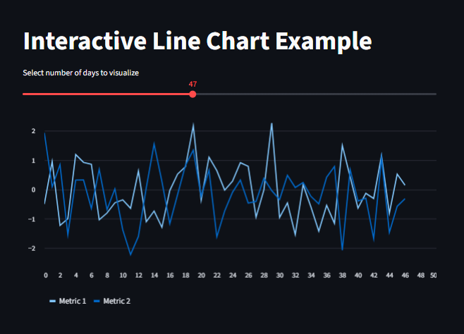
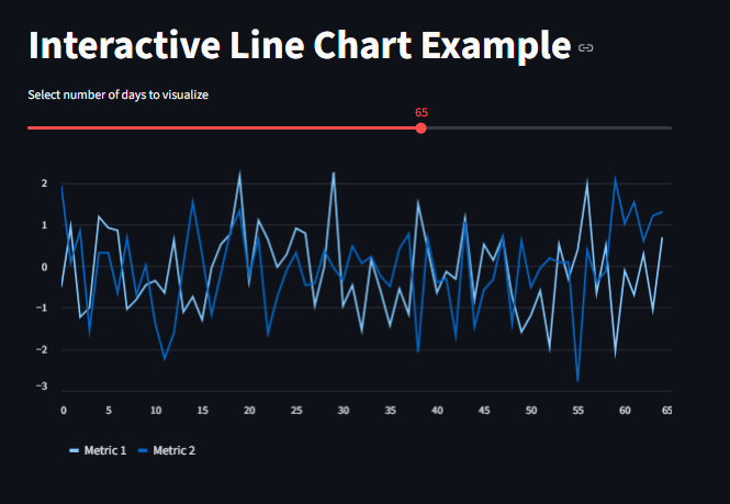
We can use User’s Input to make the line chart interactive.
					import streamlit as st
import pandas as pd
import numpy as np

st.title("Interactive Line Chart Example")

#Generate random data
days = st.slider("Select number of days to visualize", 10, 100, 20)
data = pd.DataFrame(
    np.random.randn(days, 2), columns=['Metric 1', 'Metric 2']
)

st.line_chart(data)
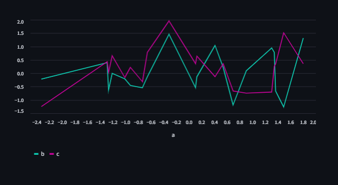
We can also change the color of the lines by setting the color parameter.
					import pandas as pd
import streamlit as st
from numpy.random import default_rng as rng

df = pd.DataFrame(rng(0).standard_normal((20, 3)), columns=["a", "b", "c"])

st.line_chart(
    df,
    x="a",
    y=["b", "c"],
    color=["#0DCDB3", "#C9029B"],
)
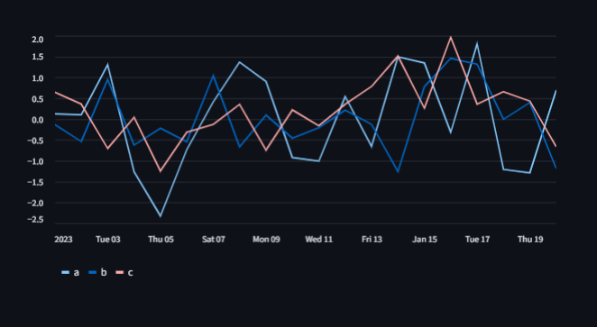
We can also plot time series data by using a datetime index.
					import pandas as pd
import streamlit as st
from numpy.random import default_rng as rng
dates = pd.date_range("20230101", periods=20)
df = pd.DataFrame(rng(0).standard_normal((20, 3)), index=dates, columns=["a", "b", "c"])
st.line_chart(df)
