Streamlit includes a built-in date picker meant for selecting dates (single or ranges).
Why calendars are important in apps: for scheduling, planning events, filtering data, and more.
- A quick look at two different ways:
- Selection like a native calendar using st.date_input.
The streamlit-calendar component gives you a full-featured calendar UI.
Need a Streamlit developer? Click Here
Native Date Input: st.date_input
Streamlit provides a built-in date picker meant for selecting dates.
let’s look at the syntax and parameters
st.date_input(label, value=”today”, min_value=None, max_value=None, key=None, help=None, on_change=None, args=None, kwargs=None, *, format=”YYYY/MM/DD”, disabled=False, label_visibility=”visible”, width=”stretch”)
| Parameter | Type | Default | Description |
|---|---|---|---|
| label | str | Required | The label displayed above the date input widget. |
| value | date, tuple, or list | "today" | The default selected date. Can be a single date or a tuple of (start_date, end_date) for a range picker. |
| min_value | date | None | The earliest selectable date. |
| max_value | date | None | The latest selectable date. |
| key | str or int | None | A unique key to identify the widget and maintain its state across reruns. |
| help | str | None | A short tooltip that appears when hovering over the input label. |
| on_change | callable | None | A callback function triggered when the date selection changes. |
| args | tuple | None | Additional positional arguments passed to the on_change callback. |
| kwargs | dict | None | Additional keyword arguments passed to the on_change callback. |
| format | str | "YYYY/MM/DD" | The display format of the date. Supports formats like MM/DD/YYYY, DD-MM-YYYY, etc. |
| disabled | bool | False | If True, disables the input so users cannot change the date. |
| label_visibility | "visible", "hidden", "collapsed" | "visible" | Controls the visibility of the label. |
| width | "stretch" or "auto" | "stretch" | Determines how wide the widget should be. "stretch" makes it expand to the container width, while "auto" fits to content. |
Basic Examples
import streamlit as st
import datetime
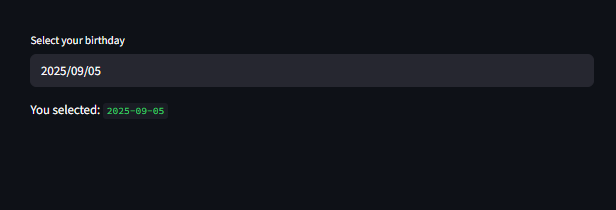
birthday = st.date_input("Select your birthday", value=datetime.date.today())
st.write("You selected:", birthday)
import datetime
import streamlit as st
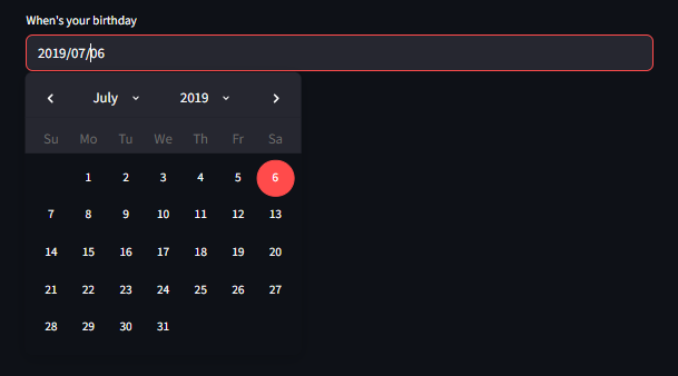
d = st.date_input("When's your birthday", datetime.date(2019, 7, 6))
st.write("Your birthday is:", d)
Date Range Picker
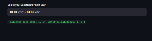
This Streamlit code creates a date range picker that lets users select their vacation dates for thenext year. It uses Python’s `datetime` module to calculate the upcoming year, sets January 1st as the earliest selectable date and December 31st as the latest. By default, the date range is pre-filled from January 1st to January 7th of the next year. The `st.date_input` widget is configured to display dates in the MM.DD.YYYY format, making it user-friendly. When the app runs, users see a calendar interface where they can select a custom vacation period within the allowed range, and the selected dates are stored in the variable `d`.
					import datetime
import streamlit as st

today = datetime.datetime.now()
next_year = today.year + 1
jan_1 = datetime.date(next_year, 1, 1)
dec_31 = datetime.date(next_year, 12, 31)

d = st.date_input(
    "Select your vacation for next year",
    (jan_1, datetime.date(next_year, 1, 7)),
    jan_1,
    dec_31,
    format="MM.DD.YYYY",
)

d
Initializing Empty Dates
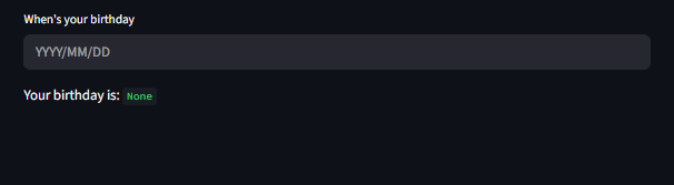
To initialize an empty date input, use None as the value
					import datetime
import streamlit as st

d = st.date_input("When's your birthday", value=None)
st.write("Your birthday is:", d)
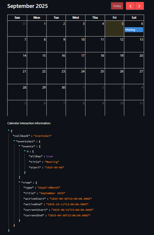
Full Calender UI
For rich, interactive calender UI’s, you can use the “streamlit-calender” component built on FullCalender
FullCalender Supports callbacks like: dateClick, eventClick, eventChange, select, eventsSet.
ensure you “pip install streamlit-calender”
					import streamlit as st

from streamlit_calendar import calendar

calendar_options = {
    "initialView": "dayGridMonth",
    "selectable": True
}


calendar_events = [
    {"title": "Meeting", "start": "2025-09-06", "end": "2025-09-06"}
]


calendar_data = calendar(
    events=calendar_events,
    options=calendar_options,
    key="my_calender"
)


st.write("Calendar interaction information:", calendar_data)
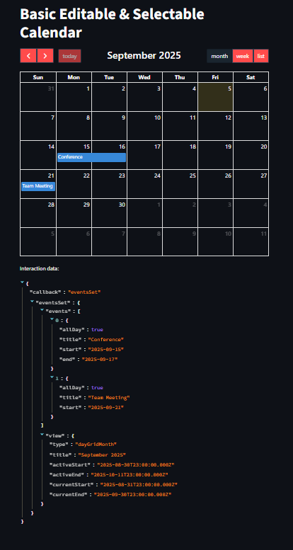
More Example on Editable & Selectable Calendar
This Streamlit app creates an interactive and editable calendar using the streamlit-calendar component. It displays a monthly view by default (dayGridMonth) with navigation buttons for switching between month, week, and list views. The events list contains two predefined events — a Conference and a Team Meeting — which are displayed on the calendar. Since editable=True, users can drag and drop events to change their dates, and with selectable=True, they can click and select date ranges to interact with the calendar. Any user interaction, such as selecting dates, moving events, or clicking them, is captured in cal_data and displayed below the calendar for tracking purposes.
					import streamlit as st
from streamlit_calendar import calendar

st.title("Basic Editable & Selectable Calendar")

options = {
    "editable": True,
    "selectable": True,
    "initialView": "dayGridMonth",
    "headerToolbar": {
        "left": "prev,next today",
        "center": "title",
        "right": "dayGridMonth,timeGridWeek,listMonth"
    }
}

events = [
    {"title": "Conference", "start": "2025-09-15", "end": "2025-09-17"},
    {"title": "Team Meeting", "start": "2025-09-21", "end": "2025-09-21"}
]

cal_data = calendar(events=events, options=options, key="basic_cal")
st.write("Interaction data:", cal_data)
Key Notes:
- Use st.date_input when needing minimal date selection.
- Use streamlit-calendar for rich, event-driven calendar UIs.
- Always pass a stable key when using calendars in dynamic layouts.
- Handle user events gracefully with structured callbacks.
Learn More about StreamLit: Click Here
Watch Videos on Streamlit:
