When building dashboards and data apps, you often need to display key performance indicators (KPIs) at a glance—such as revenue, number of users, or conversion rates. In Streamlit, the st.metric function makes it simple to show these KPIs with labels, values, and deltas (changes) in a clean, professional way.
In this article, we’ll explore how to use st.metric, from the basics to advanced use cases, and then finish with practical dashboard examples.
What is st.metric?
The st.metric function in Streamlit creates a card-style display that shows:
Label → What the metric represents (e.g., “Revenue”).
Value → The actual number or statistic.
Delta (optional) → The change compared to a previous value, shown with an arrow (🔼 increase, 🔽 decrease).
This makes it ideal for dashboards where you want to highlight trends.
Need a Streamlit developer? Click Here
Syntax
st.metric(label, value, delta=None, delta_color=”normal”, *, help=None, label_visibility=”visible”, border=False, width=”stretch”, height=”content”, chart_data=None, chart_type=”line”)
| Parameter | Type | Description |
|---|---|---|
| label | str | The header/title for the metric. Supports limited GitHub-flavored Markdown (bold, italics, inline code, links, images). Unsupported Markdown is unwrapped; escape with \ if needed. |
| value | int, float, str, or None | The main value of the metric. If None, it is displayed as a long dash (—). |
| delta | int, float, str, or None | Indicator of change shown below the metric with an arrow. Negative → red ↓, Positive → green ↑. If None, no delta is displayed. |
| delta_color | "normal", "inverse", "off" | Controls delta colors: • "normal" → positive=green, negative=red (default) • "inverse" → positive=red, negative=green (e.g., costs) • "off" → gray, no color meaning |
| help | str or None | Tooltip text shown next to the metric label (only when label_visibility="visible"). Supports Markdown. |
| label_visibility | "visible", "hidden", "collapsed" | Controls label visibility: • "visible" (default) → label shown • "hidden" → empty spacer (keeps alignment) • "collapsed" → no label, no spacer |
| border | bool | Whether to show a border around the metric card. Default = False. |
| height | "content", "stretch", or int | Height of the metric element: • "content" (default) → fit content • "stretch" → match content or parent height • int → fixed pixel height (scroll if content overflows) |
| width | "stretch", "content", or int | Width of the metric element: • "stretch" (default) → match parent width • "content" → fit content width • int → fixed pixel width (capped by parent container) |
| chart_data | Iterable or None | Optional sequence of numeric values to display as a sparkline chart. Accepts list, set, or dataframe-like object. First column is used if dataframe. |
| chart_type | "line", "bar", "area" | Type of sparkline chart: • "line" (default) → simple line chart • "area" → line chart with shaded area • "bar" → small bar chart |
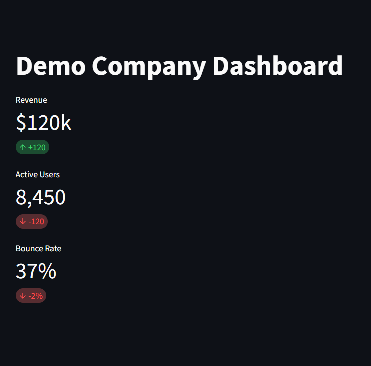
Example 1
By default:
Positive deltas show a green ↑ arrow
Negative deltas show a red ↓ arrow.
					import streamlit as st

st.title("Demo Company Dashboard")

st.metric(label="Revenue", value="$120k", delta="+120")
st.metric(label="Active Users", value="8,450", delta="-120")
st.metric(label="Bounce Rate", value="37%", delta="-2%")
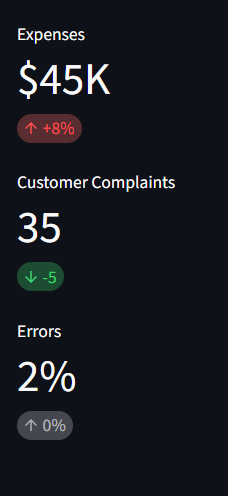
Example 2-Customizing Delta Colors
You can control how Streamlit colors the delta using delta_color.
“normal” → Increase = green, Decrease = red (default).
“inverse” → Increase = red, Decrease = green.
“off” → No color change.
					import streamlit as st


st.metric(label="Expenses", value="$45K", delta="+8%", delta_color="inverse")
st.metric(label="Customer Complaints", value="35", delta="-5", delta_color="inverse")
st.metric(label="Errors", value="2%", delta="0%", delta_color="off")
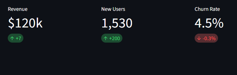
Example 3 - Displaying Multiple Metrics in a Row
you can align multiple metrics side by side using st.columns.
					col1, col2, col3 = st.columns(3)

with col1:
    st.metric("Revenue", "$120k", "+7",)

with col2:
    st.metric("New Users", "1,530", "+200")

with col3:
    st.metric("Churn Rate", "4.5%", "-0.3%")
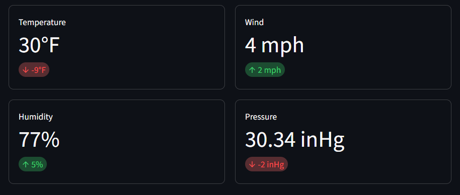
Example 4 - Creating a grid of metric cards with borders
You can add borders to your metrics to create a dashboard look
					import streamlit as st

a, b = st.columns(2)
c, d = st.columns(2)

a.metric("Temperature", "30°F", "-9°F", border=True)
b.metric("Wind", "4 mph", "2 mph", border=True)

c.metric("Humidity", "77%", "5%", border=True)
d.metric("Pressure", "30.34 inHg", "-2 inHg", border=True)
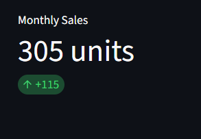
Example 5 - Dynamic Metrics from Data
you can calculate metrics dynamically from datasets.
This automatically calculate the change compared to last month.
					import pandas as pd
import numpy as np

# Sample dataset
data = pd.DataFrame({
    "month": ["Jan", "Feb", "Mar", "Apr"],
    "sales": [120, 170, 190, 305]
})

latest = data["sales"].iloc[-1]
previous = data["sales"].iloc[-2]
delta = latest - previous

st.metric("Monthly Sales", f"{latest} units", f"{delta:+}")
Best Practices
Use st.metric for high-level KPIs that users need at a glance.
Don’t overload dashboards with too many metrics; 3–6 per row is ideal.
Pair metrics with charts (st.line_chart, st.bar_chart) for context.
Choose delta_color wisely depending on whether increases/decreases are good or bad.\
Conclusion
The st.metric function is a simple yet powerful way to display KPIs in Streamlit apps. Whether you’re building a business dashboard, a finance tracker, or a health monitoring tool, st.metric helps make your data clear, engaging, and professional.
By combining it with dynamic data, conditional colors, and columns, you can create polished dashboards in minutes.
Learn more about Streamlit: Click Here
Watch Videos on Streamlit:
