st.map() is indeed used to visualize geospatial data on an interactive map.
It plots points based on latitude and longitude coordinates.
Streamlit internally uses PyDeck, which is built on Deck.gl (a WebGL-powered visualization framework).
By default, Streamlit uses Mapbox tiles for rendering the background map
Need a Streamlit Developer: Click Here
Syntax:
st.map(data=None, *, latitude=None, longitude=None, color=None, size=None, zoom=None, use_container_width=True, width=None, height=None)
| Parameter | Type | Default | Description | Example |
|---|---|---|---|---|
| data | DataFrame / np.array / dict | None | The dataset containing latitude and longitude values to plot on the map. Must include columns named lat and lon if using a DataFrame. | st.map(df) |
| latitude | str | None | Column name in data representing latitude. Use if your DataFrame column name is not lat. | st.map(df, latitude="Latitude") |
| longitude | str | None | Column name in data representing longitude. Use if your DataFrame column name is not lon. | st.map(df, longitude="Longitude") |
| color | str / sequence / None | None | Column name or constant value to color the points on the map. Useful for distinguishing categories. | st.map(df, color="Category") |
| size | str / sequence / None | None | Column name or constant to control point sizes on the map. Useful for representing magnitude or intensity. | st.map(df, size="Population") |
| zoom | int / float | None (auto) | Sets the zoom level of the map. If not specified, Streamlit automatically calculates a zoom level based on your data. | st.map(df, zoom=10) |
| use_container_width | bool | True | If True, the map automatically adjusts to the container’s width in the app. | st.map(df, use_container_width=True) |
| width | int / None | None | Explicitly sets the width of the map in pixels. Overrides use_container_width when provided. | st.map(df, width=800) |
| height | int / None | None | Sets the height of the map in pixels. | st.map(df, height=500) |
Getting Our Data Ready
st.map() requires a Pandas DataFrame or a NumPy array with columns named **latitude** and **longitude**.
If your data has different column names, you can rename them using Pandas.
The resulting map is interactive, allowing users to zoom in/out and pan around the map.
import streamlit as st
import pandas as pd
# Load your data
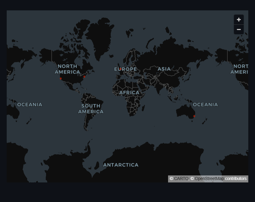
data = pd.DataFrame({
'latitude': [37.7749, 40.7128, 51.5074, -33.8688],
'longitude': [-122.4194, -74.0060, -0.1278, 151.2093]
})
# Display the map
st.map(data)
import pandas as pd
import streamlit as st
from numpy.random import default_rng as rng
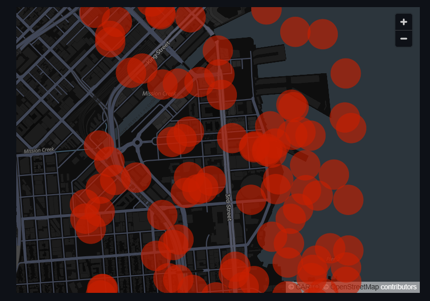
df = pd.DataFrame(
rng().random((100, 2)) / [50, 50] + [37.76, -122.4],
columns=['latitude', 'longitude']
)
st.map(df)
Setting Parameters(Zoom Level)
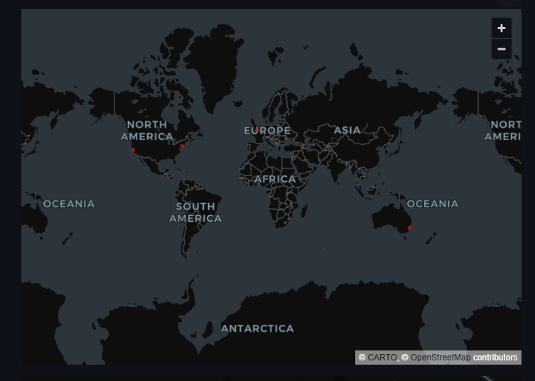
You can adjust the zoom level of the map using the **zoom** parameter.
Higher values zoom in closer, while lower values zoom out.
st.map(data, zoom=2) # Zoomed out view
st.map(data, zoom=10) # Zoomed in view
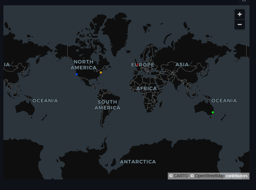
Setting Parameters(Color and Size)
You can customize the appearance of the points on the map using the **color** and **size** parameters.
These parameters accept column names from your DataFrame to determine the color and size of each point
import numpy as np
data = pd.DataFrame({
    'latitude': [37.7749, 40.7128, 51.5074, -33.8688],
    'longitude': [-122.4194, -74.0060, -0.1278, 151.2093],
    'magnitude': [5, 10, 15, 20],  # Example size metric
    'category': ["#0044ff", "#e79e0c", "#940e0e", "#04e308"]       # Example color metric
})
st.map(data,  color='category', size='magnitude', zoom=2)
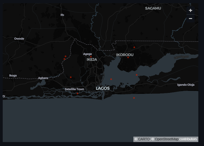
Handling Large Datasets
For large datasets, consider sampling or aggregating your data before plotting to improve performance.
You can use Pandas to sample your DataFrame:
					data = pd.DataFrame({
    'lat': np.random.uniform(6.40, 6.70, 100),   # Latitude range for Lagos
    'lon': np.random.uniform(3.20, 3.60, 100)    # Longitude range for Lagos
})
data = data.rename(columns={'lat': 'latitude', 'lon': 'longitude'})
sampled_data = data.sample(n=10)  # Sample 10 random points
st.map(sampled_data)
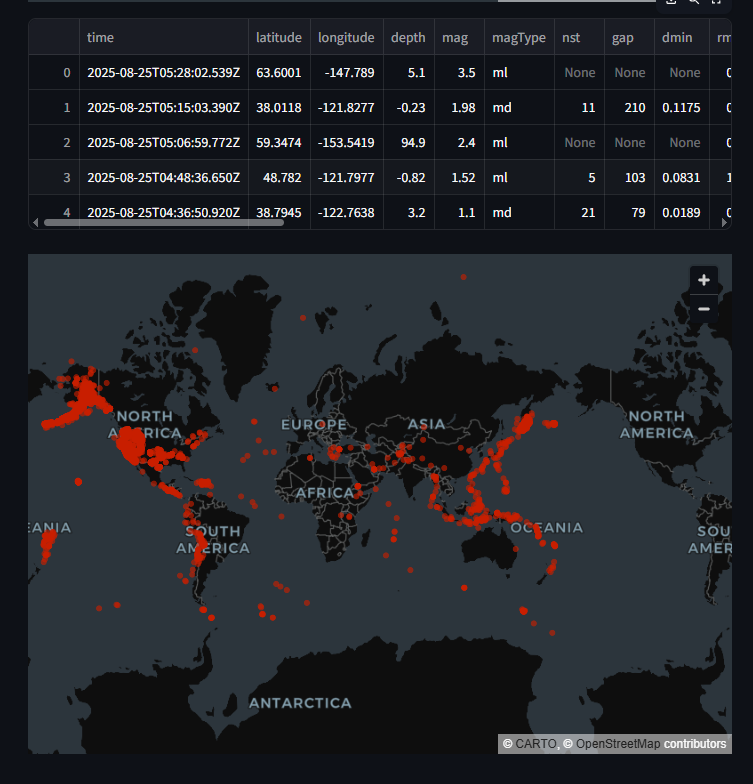
Finally, Let's use st.map() with Real-World Data
You can use datasets from sources like OpenStreetMap, Google Maps, or any geospatial dataset that includes latitude and longitude coordinates.
For example, you can visualize earthquake data, store locations, or any other geospatial information
Here’s an example using earthquake data from the USGS Earthquake Catalog:
					import requests
url = "https://earthquake.usgs.gov/earthquakes/feed/v1.0/summary/all_month.csv"
data = pd.read_csv(url)

#Of course, we need to ensure the data has the required columns by viewing it
st.write(data.head())

#Now we can plot the earthquake locations on a map
st.map(data[['latitude', 'longitude']])
st.map()is beginner-friendly and perfect for simple mapping.For advanced interactive visualizations, prefer
st.pydeck_chart().Combining both gives you the best flexibility.
Learn more about Streamlit: Click Here
Watch Videos on Streamlit:
